Tufte-style Python blog
July 10, 2026
Tufte-Python is an attempt to create a website design with the look and feel of Edward Tufte’s books and handouts. Tufte’s style is known for its extensive use of sidenotes, tight integration of graphics with text and a well-set typography.
Genesis
This theme is based on the GitHub repository by Edward Tufte, which was originally created by Dave LiepmannThis project is essentially inspired from Tufte and the R Markdown Tufte Handout format. See tufte-latex and rstudio. This post itself is an adaptation of the Tufte Handout PDF., but is now labeled under Edward Tufte’s moniker. It reached this Python generator by the way of tufte-jekyll, a Ruby/Jekyll theme that turned much of Tufte-CSS’s typographic and page-structural craft into a set of custom Liquid tags. This port stays true to its prior but swaps Ruby and Liquid for Python. The tags are now plain-text shortcodes, expanded by a small Python module in the tufte_ssg/shortcodes.py file before the rest of the page is run through Markdown.
The rest of this post is an overview of the theme’s features, with sample content directly adapted from Tufte-CSS to demonstrate visual consistency across all three iterations of this theme. Additional commentary documents the shortcode syntax and the new features bundled with this generator.
Theming, not just a settings file
Where the original Jekyll theme let you tweak fonts and colors in a single _sass/_settings.scss file compiled by Sass, this generator takes it a step further: the entire color palette lives behind CSS custom properties. A whole theme, not just one color, can be swapped at build time by editing one line in config.yml:
theme: solarized
Tufte-Python ships with nine themes (plus a print-only one): Solarized (the default, shown here), Dracula, and five variants of Gradianto. Solarized and Dracula include a light and a dark palette. They follow your system’s prefers-color-scheme automatically, with a toggle for a manual override. Try it! The whole page, including the code blocks below, re-colors itself.
Fundamentals
Color
Although paper handouts obviously have a pure white background, the web is better served by the use of slightly off-white and off-black colors or, as here, a deliberately chosen palette. Tufte’s books are a study in spare, minimalist design. In his book The Visual Display of Quantitative Information, Tufte uses a red ink to add some visual punctuation to the buff colored paper and dark ink. In that spirit, this theme reserves one accent color: the theme’s link color.
Headings
Tufte CSS uses <h1> for the document title, <p> with class code for the document subtitle, <h2> for section headings, and <h3> for low-level headings. More specific headings are not encouraged. If you feel the urge to reach for a heading of level 4 or greater, consider redesigning your document:
[It is] notable that the Feynman lectures (three volumes) write about all of physics in 1800 pages, using only two levels of hierarchical headings: chapters and A-level heads in the text. It also uses the methodology of sentences which then cumulate sequentially into paragraphs, rather than the grunts of bullet points. Undergraduate Caltech physics is very complicated material, but it didn’t require an elaborate hierarchy to organize.
Edward Tufte, forum post, ‘Book design: advice and examples’ thread
As a bonus, this excerpt regarding the use of headings provides an example of using block quotes. Markdown does not have a native <cite> shorthand, but real HTML can be sprinkled in with the Markdown text. In the previous example, the <cite> was preceded with a single return after the quotation itself. The previous blockquote was written in Markdown thusly:
[It is] notable that the Feynman lectures (3 volumes) write about all of physics in 1800 pages, using only 2 levels of hierarchical headings: chapters and A-level heads in the text. It also uses the methodology of *sentences* which then cumulate sequentially into *paragraphs*, rather than the grunts of bullet points. Undergraduate Caltech physics is very complicated material, but it didn't require an elaborate hierarchy to organize.
<cite>[Edward Tufte, forum post, ‘Book design: advice and examples’ thread](http://www.edwardtufte.com/bboard/q-and-a-fetch-msg?msg_id=0000hB)</cite>
In his later booksBeautiful Evidence, Tufte starts each section with a bit of vertical space, a non-indented paragraph, and sets the first few words of the sentence in small caps. To accomplish this using this theme, enclose the sentence fragment you want styled with small caps in a shortcode called newthought, like so:
{% newthought 'In his later books' %}
Text
In print, Tufte uses the proprietary Monotype BemboSee Tufte’s comment in the Tufte book fonts thread. font. A similar effect is achieved in digital formats with the now open-source ETBook, which this theme supplies with a @font-face reference to a .ttf file. In case ETBook somehow doesn’t work, the CSS degrades gracefully to other serif fonts like Palatino and Georgia. Notice that separate font files are included for bold (strong) and italic (emphasis) text, instead of relying on the browser to mechanically transform it. This is typographic best practice.
Code snippets imitate GitHub’s font selection using Microsoft’s Consolas and the sans-serif font uses Tufte’s choice of Gill Sans. Since this is not a free font, and some systems will not have it installed, the free Google font Lato is designated as a fallback.
Epigraphs
The English language . . . becomes ugly and inaccurate because our thoughts are foolish, but the slovenliness of our language makes it easier for us to have foolish thoughts.
For a successful technology, reality must take precedence over public relations, for Nature cannot be fooled.
If you’d like to introduce your page or a section of your page with some quotes, use epigraphs. The two examples above show how they are styled. Epigraph elements are modeled after chapter epigraphs in Tufte’s books (particularly Beautiful Evidence). As an easier alternative to hand-written HTML, this theme uses a shortcode that lets you embed elements such as epigraphs in the middle of the regular Markdown text being edited.
In order to use an epigraph in a page or section, type this:
{% epigraph 'text of citation' 'author of citation' 'citation source' %}
to produce this:
I do not paint things, I paint only the differences between things.
"How did you go bankrupt?" Two ways. Gradually, then suddenly.
Lists
Tufte points out that while lists have valid uses, they tend to promote ineffective writing habits due to their “lack of syntactic and intellectual discipline”. He is particularly critical of hierarchical and bullet-pointed lists. So before reaching for an HTML list element, ask yourself:
- Does this list actually have to be represented using an HTML
<ul>or<ol>element? - Would my idea be better expressed as sentences in paragraphs?
- Is my message causally complex enough to warrant a flow diagram instead?
This is but a small subset of a proper overview of the topic of lists in communication. A better way to understand Tufte’s thoughts on lists would be to read “The Cognitive Style of PowerPoint: Pitching Out Corrupts Within,” a chapter in Tufte’s book Beautiful Evidence, excerpted at some length by Tufte himself on his website. The whole piece is information-dense and therefore difficult to summarize. He speaks to design specifically, but in terms of examples and principles rather than as a set of simple do-this, don’t-do-that prescriptions. It is well worth reading in full for that reason alone.
For these reasons, this theme encourages caution before reaching for a list element, and by default removes the bullet points from unordered lists.
Figures
Margin Figures
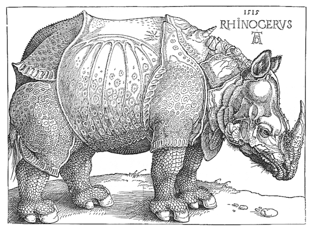
F.J. Cole, “The History of Albrecht Dürer’s Rhinoceros in Zoological Literature,” Science, Medicine, and History: Essays on the Evolution of Scientific Thought and Medical Practice (London, 1953), ed. E. Ashworth Underwood, 337-356. From page 71 of Edward Tufte’s Visual Explanations.
Images and graphics play an integral role in Tufte’s work. To place figures in the margin, use the marginfigure shortcode:
{% marginfigure 'mf-id-whatever' 'assets/img/rhino.png' 'F.J. Cole, “The History of Albrecht Dürer’s Rhinoceros in Zoological Literature,” *Science, Medicine, and History: Essays on the Evolution of Scientific Thought and Medical Practice* (London, 1953), ed. E. Ashworth Underwood, 337-356. From page 71 of Edward Tufte’s *Visual Explanations*.' %}
Note that this shortcode takes three parameters. The first is an arbitrary id. It can be named anything as long as it is unique to this post. The second parameter is the path to the image. The final parameter is whatever caption you want displayed with the figure. All parameters must be enclosed in quotes for the shortcode to work!
In this example, the marginfigure shortcode was inserted before the paragraph so that it aligns with the beginning of the paragraph. On small screens, the image will collapse into a small viewability toggle symbol: ⊕ at the location it has been inserted in the manuscript. Clicking on it will open the image.
Full Width Figures
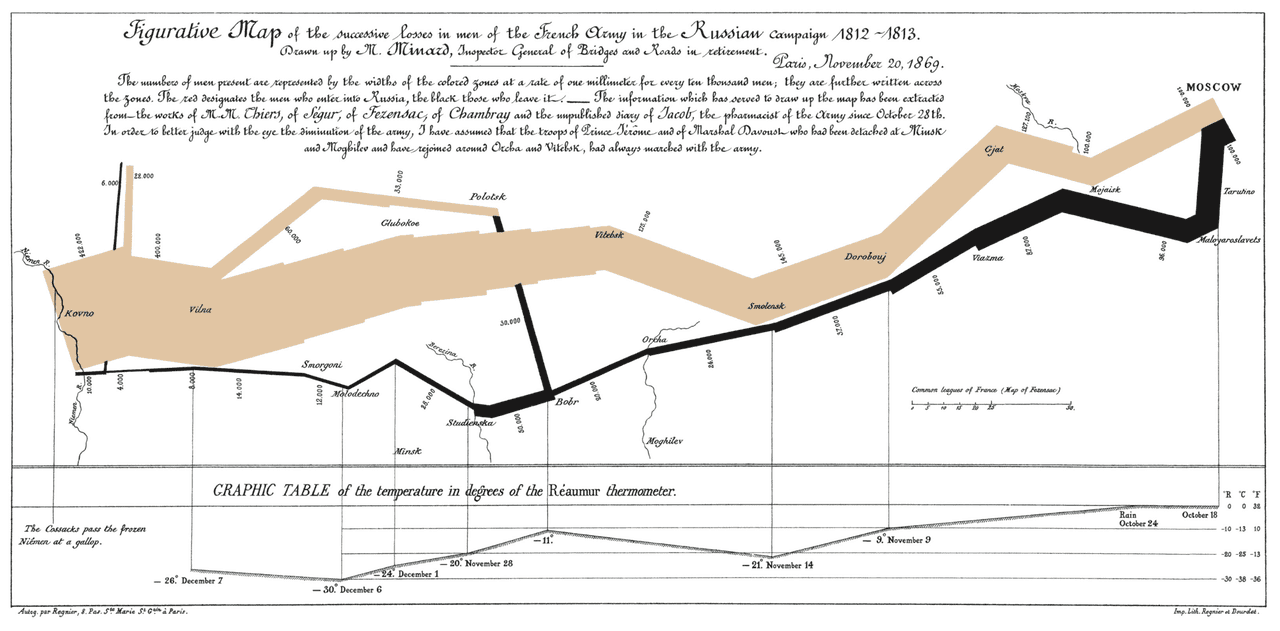
If you need a full-width image or figure, another shortcode is available to use. Oddly enough, it is named fullwidth, and this markup:
{% fullwidth 'assets/img/napoleons-march.png' 'Napoleon's March *(Edward Tufte’s English translation)*' %}
Yields this:
Main Column Figures
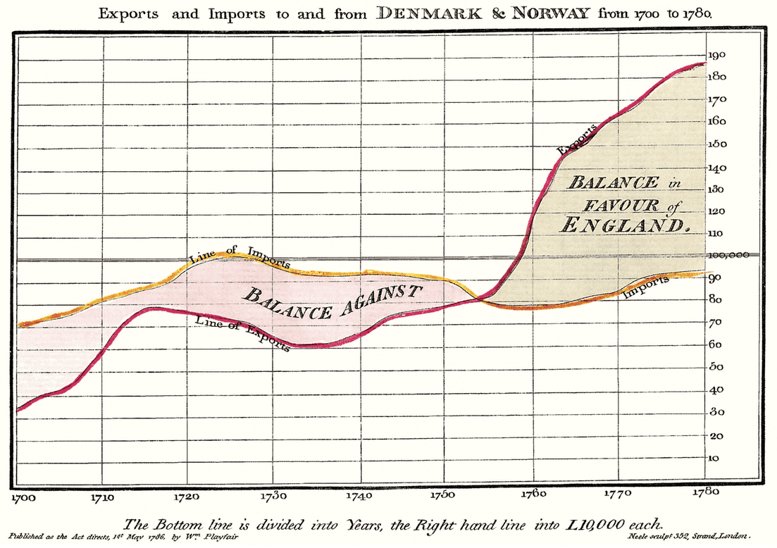
Besides margin and full width figures, you can of course also include figures constrained to the main column. Yes, you guessed it, a shortcode rides to the rescue once again:
{% maincolumn 'assets/img/export-imports.png' 'From Edward Tufte, *Visual Display of Quantitative Information*, page 92' %}
yields this:
Sidenotes and Margin notes
One of the most prominent and distinctive features of Tufte’s style is the extensive use of sidenotes and margin notes. Perhaps you have noticed their use in this document already. Their purpose is to present related but not necessary information such as asides or citations as close as possible to the text that references them. At the same time, this secondary information should stay out of the way of the eye, not interfering with the progression of ideas in the main text.
There is a wide margin to provide ample room for sidenotes and small figures. There exists a slight semantic distinction between sidenotes and marginnotes.
Sidenotes
SidenotesThis is a sidenote and displays a superscript display a superscript. The sidenote shortcode takes two parameters. The first is an identifier allowing the sidenote to be targeted by the twitchy index fingers of mobile device users so that all the yummy sidenote goodness is revealed when the superscript is tapped. The second is the actual content of the sidenote. Both should be enclosed in quotes. This theme uses the CSS counter trick to automatically keep track of the number sequence on each page or post. On small screens, the sidenotes disappear and when the superscript is clicked, a side note will open below the content, which can then be closed with a similar click. Here is the markup for the sidenote at the beginning of this paragraph:
{% sidenote 'sn-id-whatever' 'This is a sidenote and *displays a superscript*' %}
Margin notes
Margin notesThis is a margin note without a superscript are similar to sidenotes, but do not display a superscript. The marginnote shortcode has the same two parameters as sidenote. Anything can be placed in a margin note. Well, anything that is an inline element. On small screens, the margin notes disappear and this symbol: ⊕ pops up. When clicked, it will open the margin note below the content, which can then be closed with a similar click. The markup has a similar shape to a sidenote’s, just without a number involved:
{% marginnote 'mn-id-whatever' 'This is a margin note *without* a superscript' %}
Equations
This theme loads MathJax to render both inline and block-level mathematical notation. Both are written the same way you’d write them anywhere else MathJax is used. Raw $$...$$ (or \(...\)) delimiters, left untouched by the Markdown pass so MathJax can pick them up client-side.
For instance, the following inline sequence:
When \( a \ne 0 \), there are two solutions to \( ax^2 + bx + c = 0 \)
is written by enclosing a MathJax expression within a matching pair of backslash-parentheses: \( ... \):
When \( a \ne 0 \), there are two solutions to \( ax^2 + bx + c = 0 \)
$$...$$ is reserved for block/display equations that should get their own centered line, for example this block-level MathJax expression:
$$ x = {-b \pm \sqrt{b^2-4ac} \over 2a} $$
is written by enclosing the expression within a pair of $$ with an empty line above and below:
$$ x = {-b \pm \sqrt{b^2-4ac} \over 2a} $$
You can get pretty fancy, the wave equation’s nabla is no big thing:
$$ \frac{\partial^2 y}{\partial t^2}= c^2\nabla^2u $$
All of the standard LaTeX equation markup is available to use inside these blocks.
If you’d rather not rely on raw $$ delimiters, the theme also ports the original {% math %}...{% endmath %} and {% m %}...{% em %} shortcodes for block and inline math, respectively. Either way, be careful to isolate your LaTeX with blank lines above and below. Some notation, like inline matrix syntax, is finicky about it.
Tables
Tables are, frankly, a pain to create. That said, they often are one of the best methods for presenting data. Tabular data are normally presented with right-aligned numbers, left-aligned text, and minimal grid lines.
Note that there will often be a need to get some dirt under your fingernails and stoop to writing a little honest-to-god HTML directly in your Markdown. Yes, all that hideous <table>..<thead>..<th> nonsense. And you must wrap the unholy mess in a <div class="table-wrapper"> tag to ensure that the table stays centered in the main content column.
Tables are designed with an overflow:scroll property to create slider bars when the viewport is narrow. This is so that you do not collapse all your beautiful data into a jumble of letters and numbers when you view it on your smartphone.
Table 1: A table with default style formatting
| Content and tone of front-page articles in 94 U.S. newspapers, October and November, 1974 | Number of articles | Percent of articles with negative criticism of specific person or policy |
|---|---|---|
| Watergate: defendants and prosecutors, Ford’s pardon of Nixon | 537 |
49% |
| Inflation, high cost of living | 415 |
28% |
| Government competence: costs, quality, salaries of public employees | 322 |
30% |
| Confidence in government: power of special interests, trust in political leaders, dishonesty in politics | 266 |
52% |
| Government power: regulation of business, secrecy, control of CIA and FBI | 154 |
42% |
| Crime | 123 |
30% |
| Race | 103 |
25% |
| Unemployment | 100 |
13% |
| Shortages: energy, food | 68 |
16% |
This is not the One True Table. Such a style does not exist. One must craft each data table with custom care to the narrative one is telling with that specific data. So take this not as “the table style to use”, but rather as “a table style to start from”. From here, use principles to guide you: avoid chartjunk, optimize the data-ink ratio (“within reason”, as Tufte says), and “mobilize every graphical element, perhaps several times over, to show the data.Page 139, The Visual Display of Quantitative Information, Edward Tufte 2001. Furthermore, one must know when to reach for more complex data presentation tools, like a custom graphic or a JavaScript charting library.
As an example of alternative table styles, academic publications written in LaTeX often rely on the booktabs package to produce clean, clear tables. Similar results can be achieved here with the booktabs class, as demonstrated in this table:
Table 2: A table with booktabs style formatting
| Items | ||
|---|---|---|
| Animal | Description | Price ($) |
| Gnat | per gram | 13.65 |
| each | 0.01 | |
| Gnu | stuffed | 92.50 |
| Emu | stuffed | 33.33 |
| Armadillo | frozen | 8.99 |
The table above was written in HTML as follows:
<div class="table-wrapper">
<table class="booktabs">
          <thead>
            <tr><th colspan="2" class="cmid">Items</th><th class="nocmid"></th></tr>
            <tr><th class="l">Animal</th><th>Description</th class="r"><th>Price ($)</th></tr>
          </thead>
          <tbody>
            <tr><td>Gnat</td>     <td>per gram</td><td class="r">13.65</td></tr>
            <tr><td></td>         <td>each</td>    <td class="r">0.01</td></tr>
            <tr><td>Gnu</td>      <td>stuffed</td> <td class="r">92.50</td></tr>
            <tr><td>Emu</td>      <td>stuffed</td> <td class="r">33.33</td></tr>
            <tr><td>Armadillo</td><td>frozen</td>  <td class="r">8.99</td></tr>
          </tbody>
</table>
</div>
Harmon likes this style of table, so I have made it the default for unstyled tables. This uses the table support built into Python-Markdown’s extra extension. Here is a table created using ordinary Markdown table syntax, which has the side benefit of being human-readable in the raw Markdown file:
Table 3: a table created with Markdown table syntax using only the default table styling
| mpg | cyl | disp | hp | drat | wt | |
|---|---|---|---|---|---|---|
| Mazda RX4 | 21 | 6 | 160 | 110 | 3.90 | 2.62 |
| Mazda RX4 Wag | 21 | 6 | 160 | 110 | 3.90 | 2.88 |
| Datsun 710 | 22.8 | 4 | 108 | 93 | 3.85 | 2.32 |
| Hornet 4 Drive | 21.4 | 6 | 258 | 110 | 3.08 | 3.21 |
| Hornet Sportabout | 18.7 | 8 | 360 | 175 | 3.15 | 3.44 |
| Valiant | 18.1 | 6 | 160 | 105 | 2.76 | 3.46 |
Using the following Markdown formatting:
|                 |mpg  | cyl  |  disp  |   hp   |  drat  | wt  |
|:----------------|----:|-----:|-------:|-------:|-------:|----:|
|Mazda RX4        |21   |6     |160     |110     |3.90    |2.62 |
|Mazda RX4 Wag    |21   |6     |160     |110     |3.90    |2.88 |
|Datsun 710       |22.8 |4     |108     |93      |3.85    |2.32 |
etc...
The following is a simpler table, showing the Markdown-style table markup. Remember to label the table with a marginnote shortcode, and you must separate the label from the table with a single blank line. This markup:
{% marginnote 'Table-ID4' 'Table 4: a simple table showing left, center, and right alignment of table headings and data' %}

|**Left** |**Center**|**Right**|
|:--------|:--------:|--------:|
 Aardvarks|         1|$3.50
       Cat|   5      |$4.23
  Dogs    |3         |$5.29
Yields this table:
Table 4: a simple table showing left, center, and right alignment of table headings and data
| Left | Center | Right |
|---|---|---|
| Aardvarks | 1 | $3.50 |
| Cat | 5 | $4.23 |
| Dogs | 3 | $5.29 |
Code
Code needs to be monospace for formatting purposes and to aid in code analysis, but it must maintain its readability. To those ends, Tufte-Python follows GitHub’s font selection, which shifts gracefully along the monospace spectrum. Code samples use a monospace font using the ‘code’ class. Python-Markdown’s extra extension enables GitHub-flavored fenced code blocks, so both inline code such as #include <stdio.h> and blocks of code can be delimited by surrounding them with three backticks:
(map tufte-style all-the-things)
is created by the following markup:
```(map tufte-style all-the-things)```To get the code highlighted in the language of your choice, enclose the code block in three backticks followed by the language name, like this one showing the Python shortcode handler this theme uses for the fullwidth tag you saw above:
def _h_fullwidth(args, resolve_img, md_render):
    path, caption = args[0], args[1]
    caption = _inline_markdown(md_render, caption)
    return (
        f"<figure class='fullwidth'>"
        f"<img src='{resolve_img(path)}'/>"
        f"<figcaption>{caption}</figcaption></figure>"
    )
which came from this markup:
 ``` python
    def _h_fullwidth(args, resolve_img, md_render):
    blah, blah...
   ```
Syntax-highlighting colors, like everything else on this page, come from whichever theme is active.